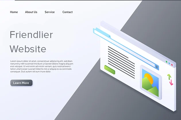
A website lives or dies by how it feels to real people in real moments. The numbers are glaring: Forbes reports that 88% of online visitors say they won’t return after a bad experience.
According to Google, 53 % of mobile sessions end if a page takes longer than three seconds to load, and each extra second of delay can slice conversion rates.
Fortunately, you don’t need a blank-check redesign to turn irritation into delight. Let’s explore how.
How to Tweak Your Website
The nine adjustments below rely on basic tools (your CMS settings, a few plug-ins, or a short block of CSS), yet they deliver the kind of speed, clarity, and personal touch that keep visitors clicking.
1. Trim and Rename Your Navigation
Human behavior is predictable – they skim first and commit later. When there are too many words, people just skip it. So, instead of saying, “Comprehensive Solutions & Services,” say just “Services.” Merge some pages (About, Mission, Team can be on one page), and cap your main menu at seven items. On phones, switch hover-to-open dropdowns to a single tap. It’s a 60-minute tidy-up that removes a silent barrier between users and the content they came to find.
2. Lighten the Page for Speed
Page weight is the sneaky villain behind long spinners and rising bounce charts. Walmart discovered that shortening page load time by one second boosted conversions by 2%. You don’t need a huge hero image; it’s better to use the space for conversion copy. Compress imagery to 70 % quality, and lazy-load anything below the first scroll so content fetches only when it’s needed.
3. Make Tap Targets Thumb-Friendly
Not everyone has a surgeon’s precision on glass. Follow Google’s 44 × 44-pixel guideline for buttons, icons, and checkboxes, then pad them so there’s no danger of hitting two at once. Forms look instantly calmer when fields get a taller line height (around 48 px), leaving room for both fingertips and eye focus.
4. Turn Up the Contrast
What seems stylish in a design file can simply be invisible on a bargain laptop or a café patio. Feed your palette through any free WCAG checker and nudge color values until text reaches at least AA contrast. If brand shades are set in stone, add a faint outline or shadow so letters stand off the background. The reward: effortless reading for everyone, including visitors with low vision or simple screen glare.
5. Sprinkle Reassuring Microcopy
Tiny phrases guide big decisions. Don’t make people think, and make every step reassuring. For instance, under a phone field, “Format: 123-456-7890” stops guesswork. Put a calming “you can edit later” near your payment button. Replace a generic “Submit” with “Get My Quote” or “Book Demo” so users instantly understand what happens next. A one-hour microcopy sweep can cut abandoned forms and support emails.
6. Surface Real-Time Context
A site feels warmer when it addresses visitors’ actual day. For instance, weather API lets you show “Sunny and 75°F in Your Area” as a small banner or icon. Retail stores can link the forecast to same-day shipping prompts; travel blogs can pair it with packing tips. It’s a two-hour dev task that makes every page look freshly updated, with no manual edits required.
7. Show Progress on Multi-Step Tasks
Signing up, checking out, or answering survey questions can feel endless if the finish line is invisible. Add a numbered step label or a progress bar (“Step 2 of 3”) at the top of each screen. Group related questions so the bar jumps forward in noticeable chunks. Users grasp that the end is near and stick around to finish, boosting completions with almost no extra coding.
8. Trim Every Form
Each additional field is a hurdle; clear half of them and watch completion soar. Ask only what you truly need to fulfill the request. Combine first and last names if separate fields don’t matter, label optional inputs clearly, and lean on browser autofill. When you must collect more data, send a follow-up email once trust is built; you’ll get better answers and fewer drop-offs.
9. Add One-Click Escape Hatches
Being stuck is the fastest path to irritation. Offer small exits everywhere: a “Back to Top” button after a single scroll viewport, a “Skip Video” link on autoplay promos, and a close icon on sticky chat widgets. These let users set their own pace, boosting perceptions of professionalism and respect.
The Takeaway
In today’s attention economy, friendliness is user experience. Visitors forgive minor design quirks, but they won’t wait, guess, or wrestle with clumsy interfaces. Give them speed, clarity, and a few thoughtful touches of personalization, and they reward you with longer sessions, more traffic, and more conversions.
Nine small upgrades (no fancy rebuild, no sky-high budget) are enough to move the needle and keep people coming back happily. Do the tweaks one at a time if resources are slim: measure bounce rate, form completions, and time on page before and after each change. The data will show which fixes matter most for your audience, and you can keep iterating from there.